In online stores, the customer doesn't touch the product before buying, doesn't meet you face-to-face, doesn't see an office or a showroom. All they have to decide is: What they see on the screen, and what they feel within seconds. This is where Visual identity.
Identity is not just a “pretty logo,” but a whole ecosystem that makes the customer feel that the brand Professional, clear, reliable. The direct result? More trust, less hesitation, more conversion.
The issue is that many stores start with a haphazard design: A color here, a font there, different banners, inconsistent images. The store works, but it doesn't make an impact and doesn't build a strong trust, so the competition is only discounting. Brands that build a clear identity can sell the same product at a higher price because the impression is different.
In this article, we will explain the visual identity of e-commerce stores in a practical way: What shapes it, how it affects trust, and how it relates to the user experience and purchase decision from first visit to checkout.
1) What is visual identity in an online store?
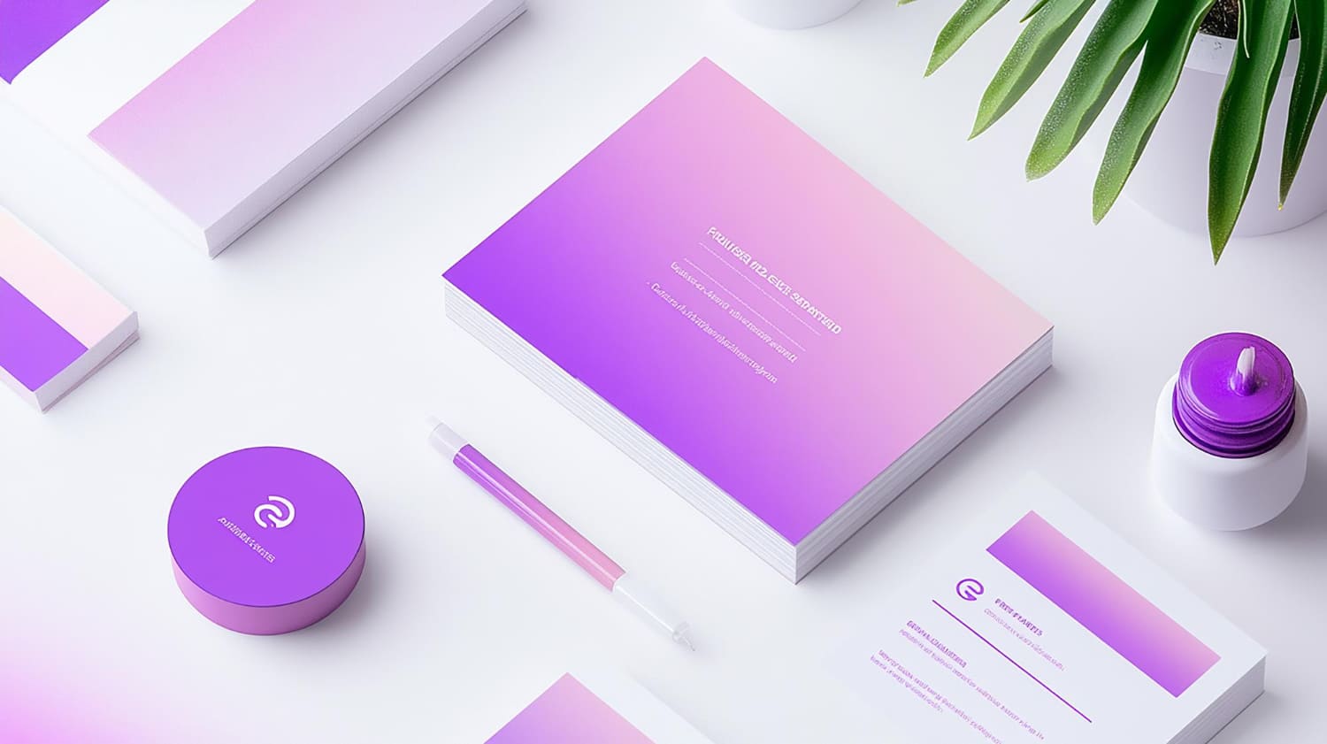
Visual identity is the “language” of the brand. It is the way a customer recognizes you even before they read the details. It usually consists of:
- Logo
- Primary and secondary colors
- Arabic and English fonts
- The style of the photos (shooting style, backgrounds, lighting)
- Iconography and graphics
- How to design banners and displays
- The tone of short in-store texts (buttons, titles, trust statements)
When these elements are consistent, the customer feels that the store is “tidy,” “stable,” and “trustworthy.” When they are inconsistent, they subconsciously feel that there is chaos or unprofessionalism-even if the product is excellent.
2) Why Visual Identity Builds Trust (The Psychological Logic Behind Buying)
Trust in e-commerce doesn't come from words like “trusted” alone. It comes from accumulated signals:
- Design symmetry
- Clarity of reading
- Photo quality
- Order of information
- The ubiquitous presence of a sign
A cohesive identity gives the customer a sense that there is a team behind the store that understands what they are doing, and that the experience won't be chaotic after checkout. This reduces the “risk of purchase” in the customer's mind.
3) Trust from the first visit: What should a customer see in the first 5 seconds?
The first five seconds determine whether they continue or leave. This is where identity should help you answer quickly:
- Who are you?
- What are you selling?
- Why are you special?
- Can I trust you?
How does identity support this?
- Clear logo in the right size
- Eye-pleasing colors and clear text contrast
- Easy-to-read font on mobile
- Professional photos of the product or associated lifestyle
- A main banner that expresses the product and feature, not just a generic image
If the identity is strong, the customer is reassured before they read the details.
4) Colors: Don't choose them because you “like them”... choose them because they serve your purpose
Colors in an online store have two functions:
- Reflecting the brand's personality
- Customer Decision Orientation
Practical example:
- A luxury product store often needs muted colors and more white space
- A youthful product store might suit a more vibrant color palette
- A health or natural store might suit a quieter tone associated with nature
More important than the color itself:
Do you use it consistently? Is the buy button clear? Do the offers not seem “screaming”?
Common mistake:
Using too many colors without order, the store becomes cluttered.
Result:
Customers are distracted, and trust is diminished.
5) Fonts: An overlooked but important point that affects the conversion
Arabic calligraphy in particular in the Saudi market is very important.
If the font is unclear, small, or tired on mobile, the customer will get tired and leave.
A practical rule of thumb for stores:
- Font for headings gives personality
- A font for text that is simple and legible
- Fixed and scaled sizes (don't put a small title and a large description randomly)
A strong visual identity makes for comfortable reading, and that alone increases dwell time and chances of purchase.
6) Photos: The biggest trust factor in an online store
The stores that sell the most are not always the cheapest, but the ones that make the customer “see” the product clearly.
Images are an essential part of identity.
What makes images serve identity?
- Fixed shooting style (same lighting, same background)
- Frequent product corners
- Photos showing size and usage
- “Lifestyle” photos give a sense of the product in real life
Mistakes that hurt trust:
- Images from different sources of varying quality
- Random wallpapers
- Poorly cut product
- Few photos
The customer translates poor images into: “The product itself may be shoddy.”.
7) Banners and offers: How not to kill identity with discounts?
Many stores are losing their identity because of banners:
- Contrasting colors
- Different lines
- Too many phrases
- crowded design
Offerings should be part of the identity, not something separate from it.
Practical solution:
- Create static banner templates
- Same main color + auxiliary color
- The same lines
- Same as the price and discount mode
- Short text and one message
In this way, even the opponent appears “classy” and “professional”.
8) Product and checkout pages: Identity doesn't end with design... it ends with trust at checkout.
The customer arrives at the checkout page more hesitant than ever.
Identity should support reassurance, not distract it.
What should be clear?
- The checkout button is clear
- The information is arranged
- Calm colors reduce stress
- No “heavy” or confusing items
- Trust statements are present: Return policy, customer support, payment methods
A common mistake:
The design is beautiful on the homepage, and then becomes plain and confusing on the checkout pages.
This reduces the conversion directly.
9) How to properly build a visual identity for an online store (practical steps)
- Identify the personality of the label: Luxury? Youthful? Practical? Natural?
- Choose a limited and clear color palette
- Choose two consistent fonts (headings/text)
- Select the style of images (background, lighting, angles)
- Design static templates for banners and displays
- Standardize icons and graphics
- Create a simple guide to ensure that everything is implemented in the same way
With these steps, the store becomes “cohesive” and this increases trust.
10) Signs that your visual identity is weak
- The store looks like a “collage” of different parts
- Banners vary from page to page
- The colors are many and inconsistent
- Asymmetrical fonts
- Product images of varying quality
- The customer asks a lot of questions about obvious things (because the offer is not clear)
- High traffic and low conversion despite good prices